Montague Brand Identity
Client
Look and Feel for The Montague Company
Project Overview
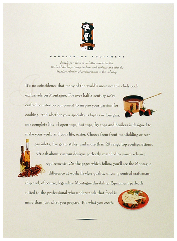
Patrick noticed Montague Equipment while searching for an industrial range for his home. Because it was an East Bay manufacturer, he called to inquire about a marketing partnership. This led to a proposal for a new logo, graphic standards and applications ranging from product emblems to business stationery.
We began by revisiting their nondescript globe graphic. Couldn't we imagine a logo with personality to match the line? One competitor used a wolf, (known in the business as the Red Dog). Further research suggested we consider a chef, since Montague was known as the pinnacle of cooking equipment by the finest chefs.
Our solution—a solid craftsman-like image that imparts confidence and respect—was exactly where we wanted to take the brand. We chose two elegant fonts and a palette of copper and cream to convey quality. Soon the new brand identity was receiving an enthusiastic respopnse by dealers and customers alike. The following year, Montague called on us to develop a range of new collateral, sales sheets, an ad campaign and a handsome trade show exhibit.
