SureHarvest Website
Client
SureHarvest
Project overview
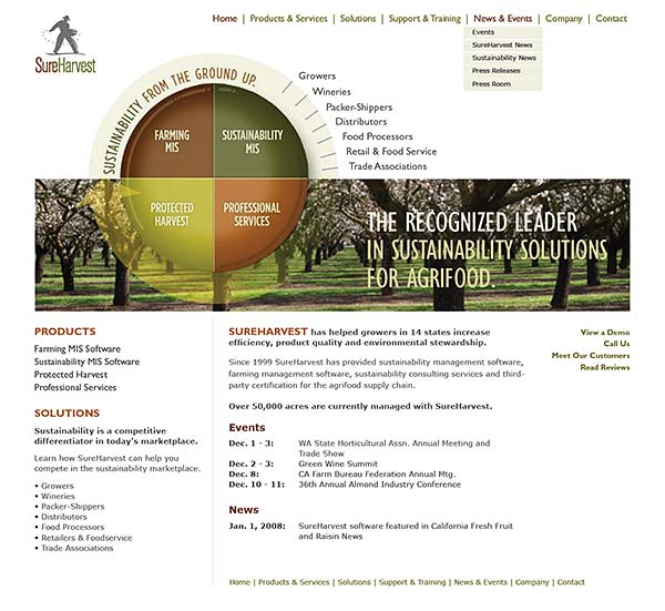
This site is a redesign of one we delivered in 2005, reflecting company growth and diversification into markets higher up the agrifood value chain. We devised an animated homepage icon that allows users to choose content that pertains to them. And we wrote multiple headlines, placing them over crop images as banners. The site is quite deep – over a hundred pages of content.
As the design agency for all of the corporate ID and collateral, we were able to provide a consistent look and feel that echoed their branded portfolio of sales materials. We worked with SureHarvest's Marketing manager to map out the content and deliver layered Photoshop files to developers using the DotNet Content Management System.
