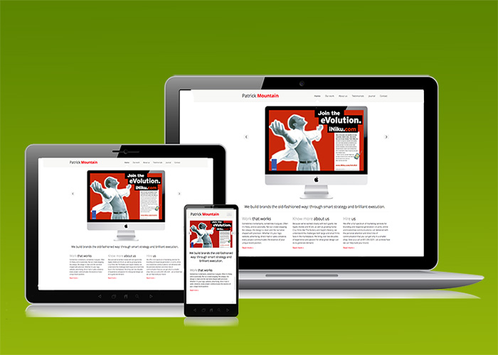
We’re loving Responsive Design, and recommend it whenever there’s a potentially large mobile audience for which we can serve up easy-to-view imagery with no “pinching up”. This site is a good example.
It reacts at multiple breakpoints to keep the body text at a consistent size and images which fill the available space. Cool, yes? We think so, in fact it seems almost magical. Whether our viewers visit us from a desktop, tablet or mobile device, they’re able to read our copy without squinting. What a terrific idea, right?
This is a huge shift in thinking for designers, who have historically had a fixed layout in which to work and play. It’s taken a year of online research, several seminars and three college classes to fully understand how to approach the modular nature of fluid layouts. With this project, we’re now more confident that we’ve mastered another skill that will assure our clients deliver a better brand experience.
Our new agency website not only demonstrates our responsive design chops, but makes our portfolio easier to review. And there are links to our Facebook and Google+ pages. To keep content fresh for both Google and friends and family, we’re adding blog posts from time to time under the navigation title “Journal.” Mostly shop talk mixed with a bit of best practice commentary. To hold our existing page rank (such as it is), we’ve developed a list of 301 redirects, just like we do for our clients.
Before launching, we conducted speed tests, which show a vary acceptable load speed. So over time, what once was a final responsive design project for a college coding class, has morphed into the next generation of www.patrickmountain.com.
It’s been a long time coming.
