Adobe may well afford to run double-truck ad spreads in global design and photography publications. We know because we’ve developed international media plans and executed placements here and aborad featuring three gorgeous ad spreads for them back in the day for Photoshop.

But what if you’re a local retailer with a tight budget, or perhaps you need to maintain an ongoing presence in an array of media because your audience can’t be targeted with just a couple books? What to do? Enter the small-space unit, or fractional ad.
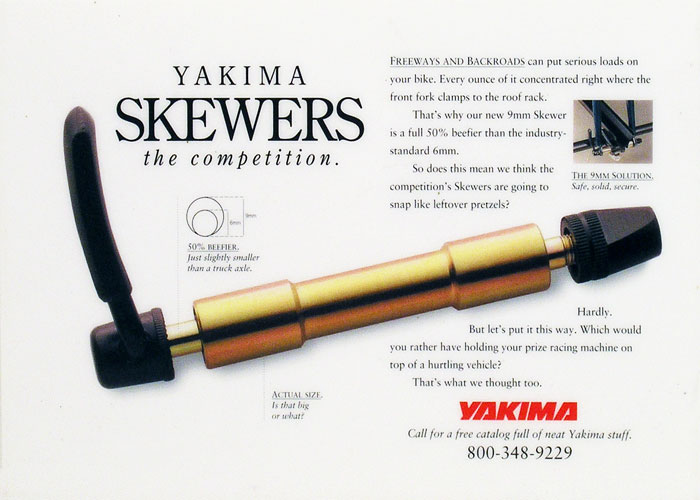
We’ve created lots of hard-working small-space ads, like the “Skewers” ad showcasing a hefty rod on Yakima’s bike racks, a few centimeters larger than the competiton, but still worthy of celebration.

We put the same energy into creating a square third page unit as we do when we’re given more real estate to work with, because with humility, that’s how we roll.
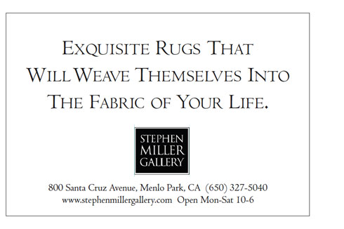
Actually small space is often more challenging, since copy needs to remain a readable size and long headlines can fill the available space, as in this San Francisco Chronicle fractional for Stephen Miller.
Sometimes small-space ads have an advantage over larger units because they are the only ad on the page, as is the case with vertical half-page ads.

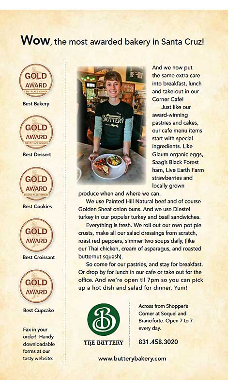
This full-color fractional ad for The Buttery gives plenty of reasons in the copy to enjoy this neighborhood bakery cafe, including publicizing coveted “Best Of” entertainment weekly awards.
Patrick coined the tagline, “The Most Awarded Bakery in Santa Cruz”and used it as a headline for this insertion. Mentioning fresh, organic and local ingredients and offering foodies details of our everyday prep can’t help but interest discriminating tastes. Hey, we say if you’ve got it, flaunt it.
