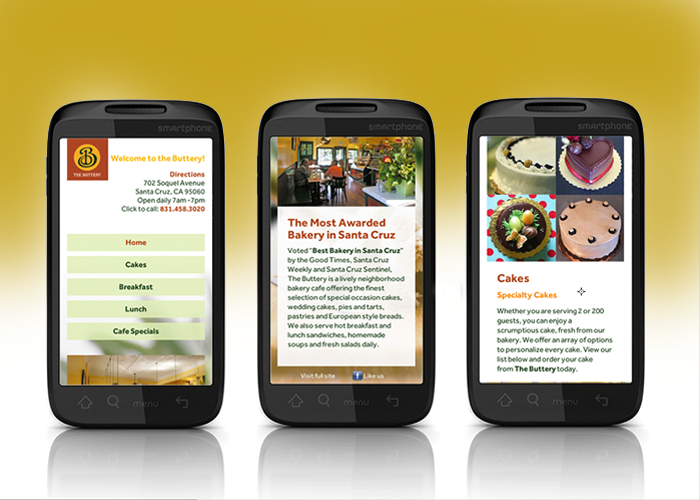
Google Analytics shows that of the 4,676 visitors who visited The Buttery Bakery and Cafe’s website, 1,346 of them searched on a mobile device. That means 29% of our visitors must “pinch up” pages to read them. We felt this makes for a less-than-favorable brand experience. And our client agreed. So this week we’ve proudly taken the wraps off a new mobile site!
Designed and developed by Patrick Mountain Brand Marketing, the new site features serveral user-friendly features which shows up right at the top of the homepage. Visitors can simply click the phone number and automatically dial The Buttery. How handy is that? Need directions? Just click to get Google driving directions. And of course The Buttery’s hours of operation are right up front.
Unlike some mobile sites that sequester navigation into a little dropdown box, we didn’t hide the main menu, so our pages are easy to access. We’ve offered only key content of interest to mobile viewers, so the site is super easy to browse.
We’re anticipating fewer dropoffs and longer page visits with this purpose-built mobile alternative which is served up for display sizes 450 pixels wide and below. See the new mobile site for yourself!
